library(tidyverse)
library(wooldridge)
data("approval")Appendix A — Basic ggplot2
A.1 Plotting in the tidyverse
ggplot2 forms a key part of the tidyverse – for many the only part. It builds on the grammar of graphics proposed by the late Leland Wilkinson, Wilkinson (2013). In essence it provides rules for how graphics should be treated, simple rules that drive you mad until you get it.
The process for building a graph is something like the following.
- Initiate a plot using
ggplot. - Specify aesthetics which indicate what you want to plot from some data set.
- Call a
geom(or an alternative) to say how you want to plot it. - Add modifiers to change how it looks.
The order of operations is essentially always this, although quite how the ordering is apllied differs subtly, which we will show here.
A.2 Example
To illustrate, we take the wooldridge data set approval from Yong, Krosnick, and Wooldridge (2016), do a little wrangling and (eventually) produce some quite nice plots. Start with the libraries and retrieve data the data.
The first few columns and rows of this looks like:
   id month year   sp500   cpi cpifood approve
1 302     2 2001 1239.94 184.4   171.8   59.24
2 303     3 2001 1160.33 185.3   172.2   57.01
3 304     4 2001 1249.46 185.6   172.4   60.31
4 305     5 2001 1255.82 185.5   172.9   55.82
5 306     6 2001 1224.42 185.9   173.4   54.93
6 307     7 2001 1211.23 186.2   174.0   56.36
and all the available variables are
names(approval) [1] "id" "month" "year" "sp500" "cpi"
[6] "cpifood" "approve" "gasprice" "unemploy" "katrina"
[11] "rgasprice" "lrgasprice" "X11.Sep" "iraqinvade" "lsp500"
[16] "lcpifood" Typically we want to investigate trends and correlations and graphing pairs or more of series is a good way to begin.
A.2.1 Scatter plot
A first scatter plot, using geom_point of food against gas (petrol) prices
ggplot(approval, aes(x=lcpifood, y=lrgasprice)) +    # Initiate, set aesthetics
  geom_point()                                       # Display as points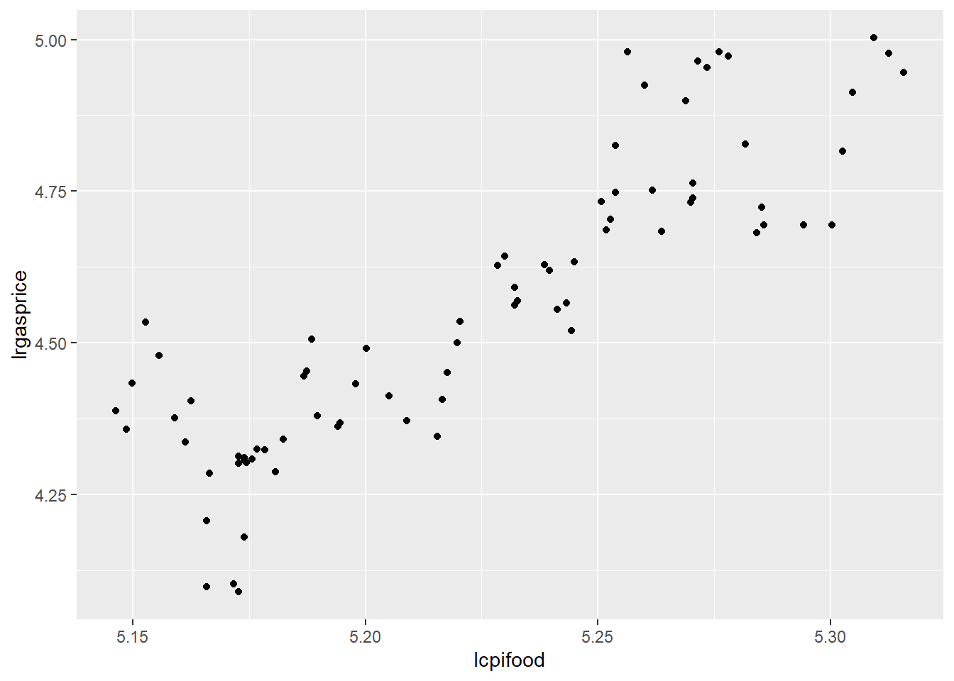
OK, I guess, but a bit dull – so add some colour. This time, aes is specified in the geom – either is fine, but there are some advantages either way which we will see shortly.
ggplot(approval) +
  geom_point(aes(x=lcpifood, y=lrgasprice, color=month))  # Colours by month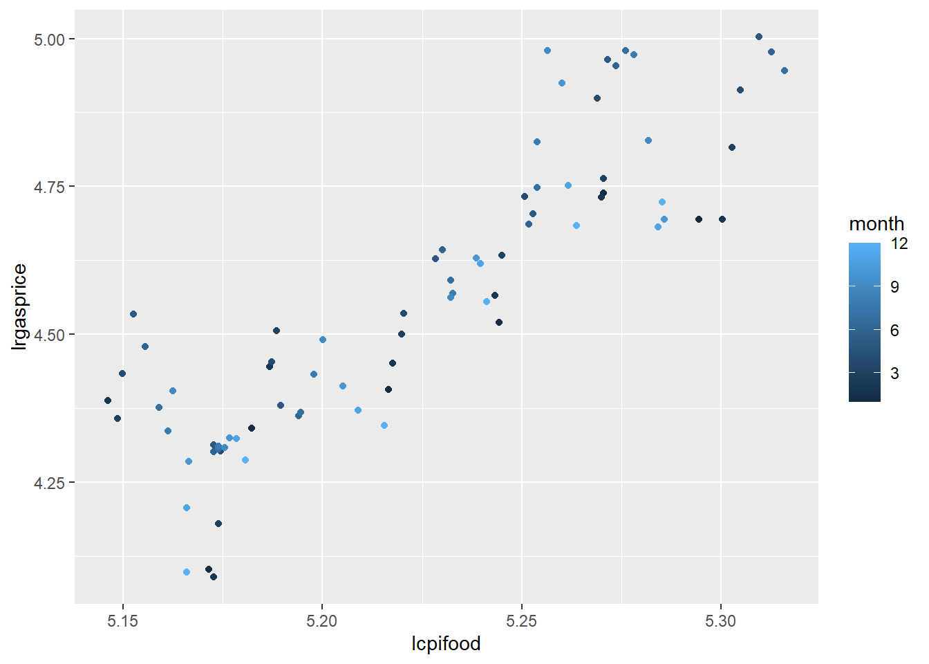
Better, but how about…
ggplot(approval) +
  geom_point(aes(x=lcpifood, y=lrgasprice, color=approve), size=2, shape=17) + # Colours by popularity!
scale_color_gradient(low="red", high="green") 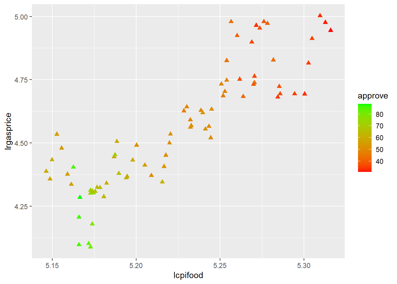
where the colours are a gradient we specify. But months can only be one of twelve categories, so a categorical variable (a factor) is needed to get different actual colours, otherwise for a continuous variable I get shades of one colour or a continuous change we need to specify.
Lets do this – and add a different aesthetic, size, for year.
ggplot(approval) +
  geom_point(aes(x=lcpifood, y=lrgasprice, color=as.factor(month), size=as.factor(year)))
Warning: Using size for a discrete variable is not advised.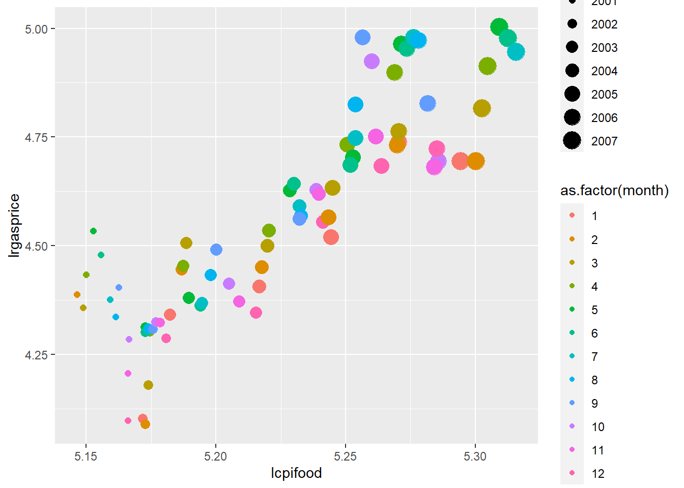
Note there is now a lot going n, and maybe too much. ggplot thinks so!
A.2.2 Time series plots
Our time index is a bit odd as the data set has year and month separately. Create a proper date series using:
approval %<>%
  unite(date, year, month, sep="/") %>%
  mutate(date = as.Date(paste0(date,"/01"), "%Y/%m/%d"))
I’ve used the %<>% pipe operator to send and get back approval so this is now
   id       date   sp500   cpi cpifood approve gasprice unemploy katrina
1 302 2001-02-01 1239.94 184.4   171.8   59.24    148.4      4.6       0
2 303 2001-03-01 1160.33 185.3   172.2   57.01    144.7      4.5       0
3 304 2001-04-01 1249.46 185.6   172.4   60.31    156.4      4.2       0
4 305 2001-05-01 1255.82 185.5   172.9   55.82    172.9      4.1       0
5 306 2001-06-01 1224.42 185.9   173.4   54.93    164.0      4.7       0
6 307 2001-07-01 1211.23 186.2   174.0   56.36    148.2      4.7       0
  rgasprice lrgasprice X11.Sep iraqinvade   lsp500 lcpifood
1  80.47723   4.387974       0          0 7.122818 5.146331
2  78.08958   4.357857       0          0 7.056460 5.148656
3  84.26724   4.433993       0          0 7.130467 5.149817
4  93.20755   4.534829       0          0 7.135544 5.152713
5  88.21947   4.479828       0          0 7.110222 5.155601
6  79.59184   4.376912       0          0 7.099391 5.159055
Then I can plot a couple of series using two calls to geom_line
ggplot(approval) +
  geom_line(aes(x=date, y=unemploy), colour="red") +
geom_line(aes(x=date, y=cpi), colour="blue") 
But this is pretty inefficient, as I would need a call to geom_line for every series I wanted to plot and even then scales are unsuitable. Plus the labels are not right.
This is where things really get interesting. I pivot_longer all the variables into a single column.
df <- pivot_longer(approval, cols=-c(date, id), names_to= "Var", values_to = "Val")
head(df)
# A tibble: 6 × 4
id date Var Val
<int> <date> <chr> <dbl>
1 302 2001-02-01 sp500 1240.
2 302 2001-02-01 cpi 184.
3 302 2001-02-01 cpifood 172.
4 302 2001-02-01 approve 59.2
5 302 2001-02-01 gasprice 148.
6 302 2001-02-01 unemploy 4.6Great! Now I can plot Val using one call to geom_line. This time, put the graph object into p and then explicitly plot it.
p  <- ggplot(df) +
  geom_line(aes(x=date, y=Val))
plot(p)
Oops! I need to tell ggplot2 to separate out the variables which are stored in Var. For this, use group:
p  <- ggplot(df) +
  geom_line(aes(x=date, y=Val, group=Var))
plot(p)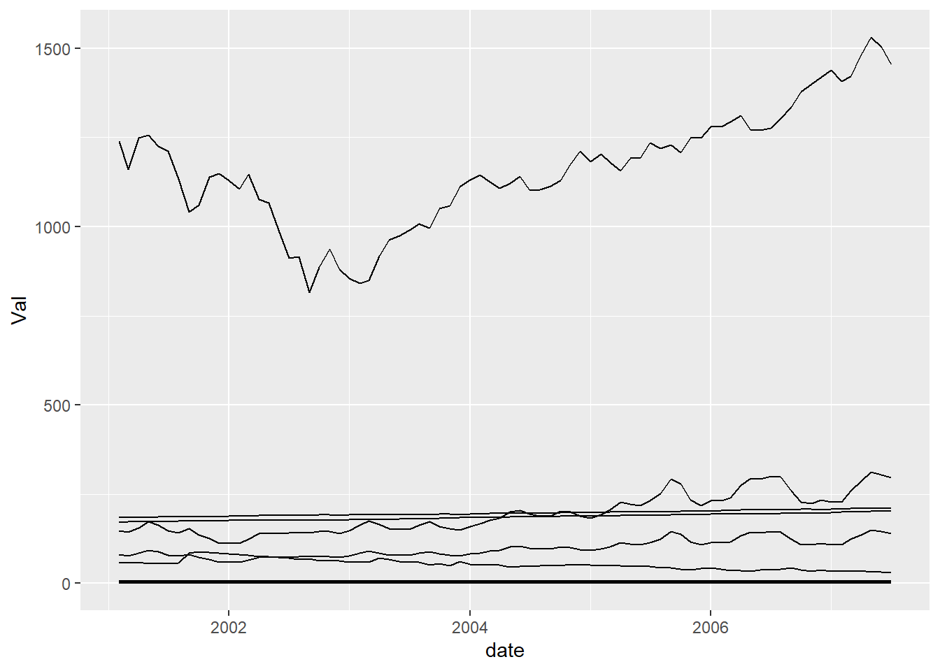
But this could better be done by using an aesthetic like colour which implies group
p  <- ggplot(df) +
  geom_line(aes(x=date, y=Val, colour=Var))
plot(p)
OK, but can I plot them so we can see what’s going on, like in a grid? This is where facet comes in.
p  <- p +
  facet_wrap(~Var, scales = "free")
plot(p)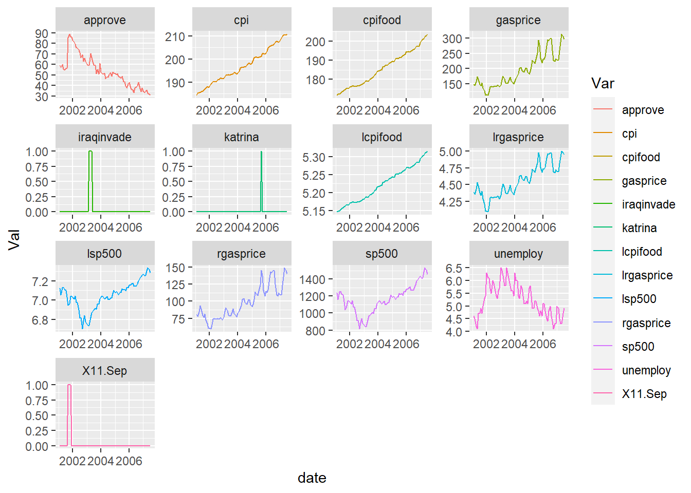
A bit more formatting…
p  <- p +
  theme_minimal() +
  labs(title="Facet plots", x="", y="")
plot(p)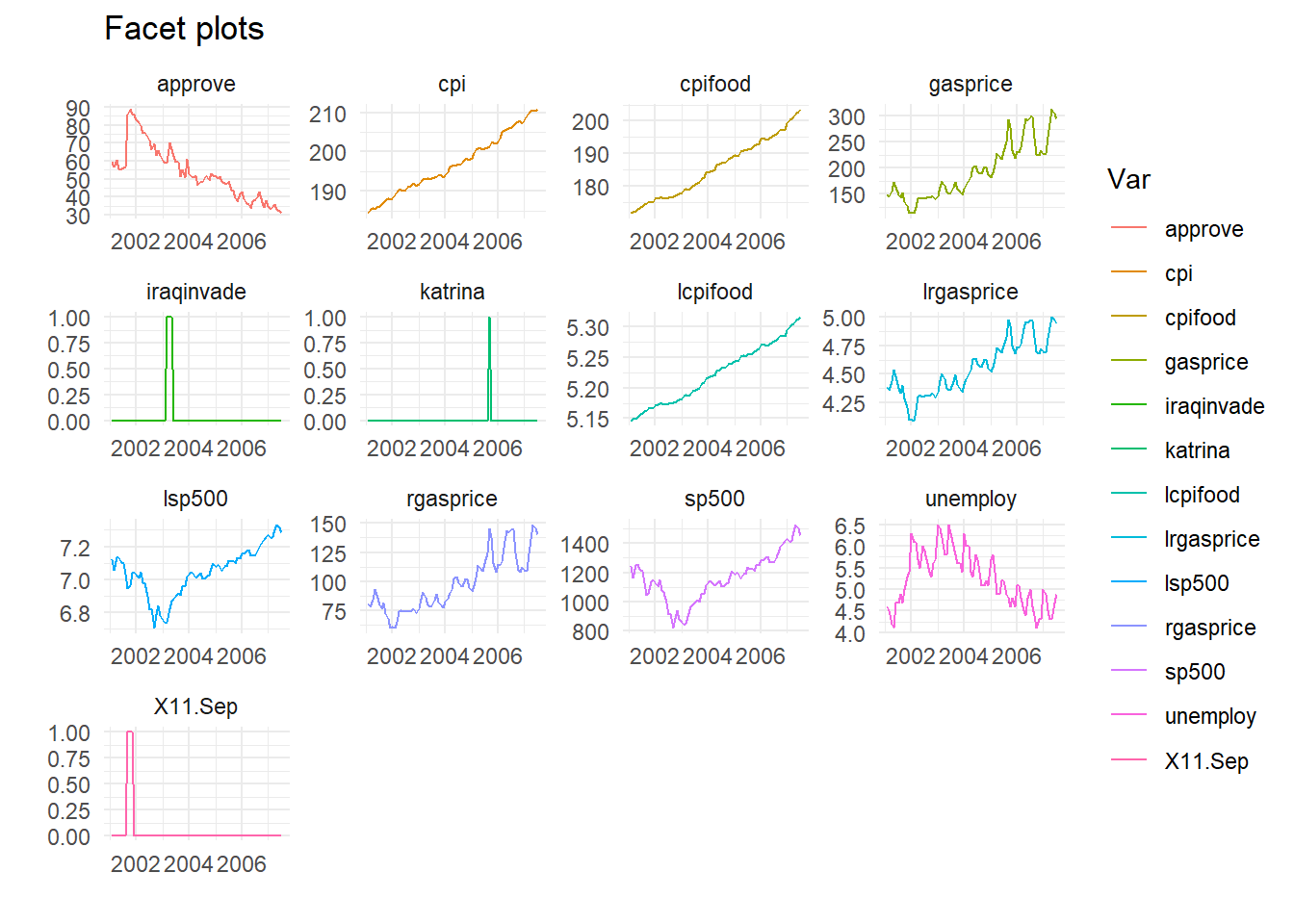
Finally all in one go, dropping the dummies, don’t store as an object. Also no legend, as series labelled in the facets. And I call a rather handy little function geom_smooth which fits (by default) a Loess smoothing line.
approval %>%
  select(-iraqinvade, -katrina, -X11.Sep) %>%
  pivot_longer(cols=-c(date, id), names_to="Var", values_to="Val") %>%
  ggplot(aes(x=date, y=Val, group=Var, colour=Var)) +
  geom_line() +
  geom_smooth() + # Smoother
  facet_wrap(~Var, scales = "free") +
  theme_minimal() +
  theme(legend.position = "none") +
  labs(title="Facet plots", x="", y="")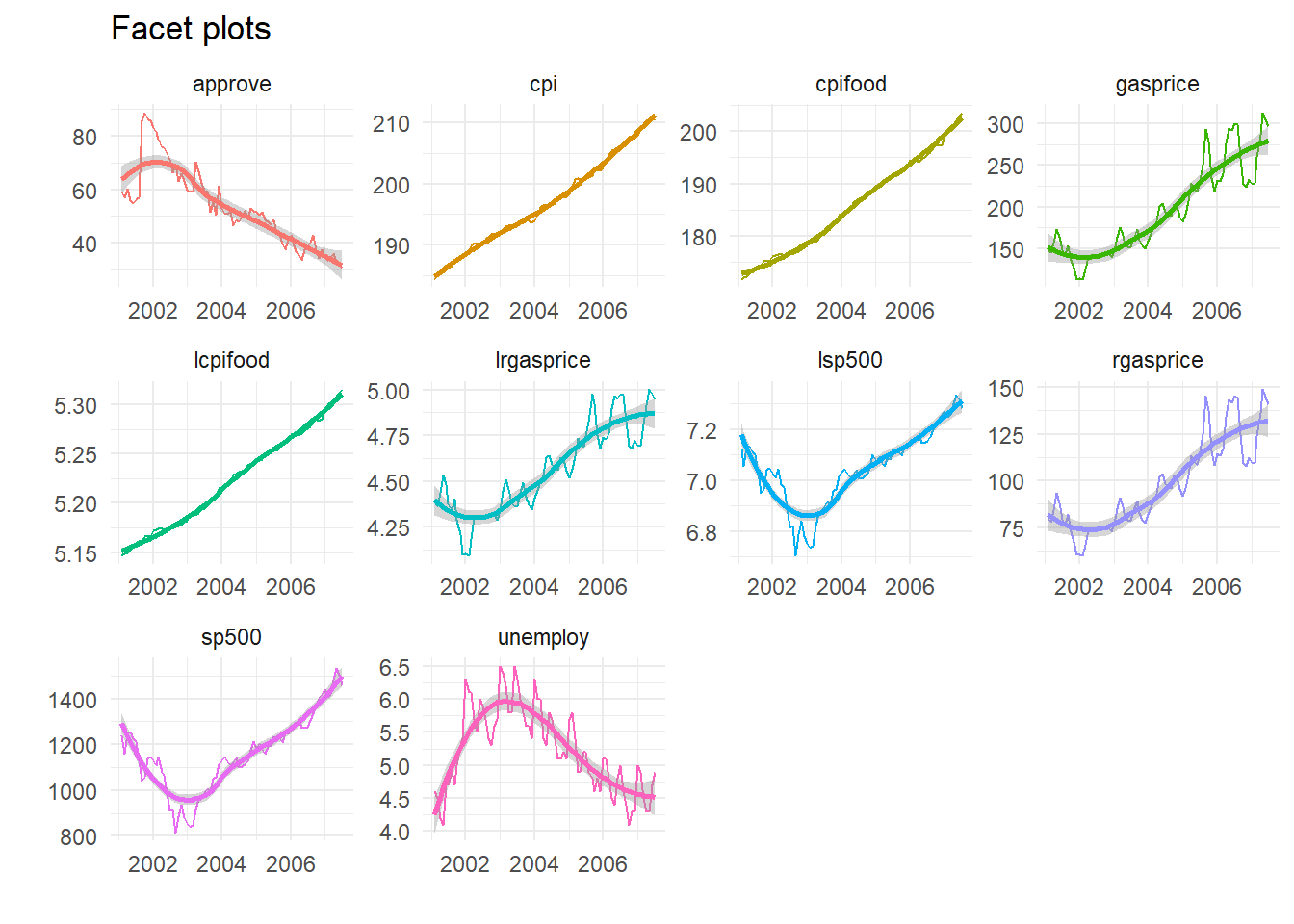
Cool, huh?