7  Quantile fan charts

7.1 Quantile regression

QR is a powerful technique building on the insight that the predicted value of a regression need not be the conditional mean. Instead QR models a chosen conditional quantile of the distribution of the target variable.

The predicted quantiles can be used individually, perhaps as a proxy for risk, or used to approximate a complete predicted density. It is the last of these that particularly concerns us.

Gaglianone and Lima (2012) estimate forecast densities for the U.S. unemployment rate using the consensus forecast from the Survey of Professional Forecasters (SPF). This generalizes the proposition of Capistrán and Timmermann (2009), that we can efficiently combine forecasts by regressing the consensus (usually mean) forecast on the out-turn and use the resulting equation for point-forecasting unemployment, to one where the density of the combined forecast is predicted.

They suggest:

‘The resulting density forecast is far from normal and is therefore able to reflect the current increased risk of a higher unemployment rate in the U.S. economy provoked by the recent subprime crisis.’ Gaglianone and Lima (2012), p. 1598

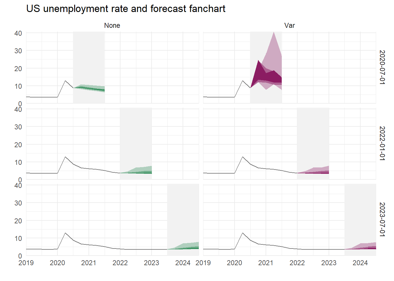
This highlights the two useful features that makes this technique so valuable. The estimated forecast density need not be normal and is potentially state dependent. But it is difficult to tell how significant this effect is from one graph, or whether the upward spread of the density is associated with the subprime crisis. What happens if the unemployment rate is radically different from the experience of 2010? As the subprime crisis is no longer quite so recent we consider the following: when and how are the QR-forecast densities for U.S. unemployment asymmetric?

Capistrán and Timmermann (2009) suggested combining forecasts by regressing the out-turn on the mean forecast. For unemployment forecasts would be \[ u_{t+k} = \beta_0+\beta_1 \hat u_{t,t+k}+\varepsilon_{t+k} \] where \(u_t\) is the quarterly unemployment rate expressed as a percentage and \(\hat u_{t,t+k}\) is the SPF’s mean forecast, \(k = 1\) to 4 quarters ahead. They find this an effective way to combine forecasts from different sources particularly with a non-stationary panel of forecasters, characteristic of the SPF. This models the conditional mean of unemployment as a ‘bias corrected’ forecast from the aggregated information.

Gaglianone and Lima (2012) use QR instead of OLS, and predict the \(\alpha\)-quantile of \(u_{t+k}\) so that \[ Q_\alpha(u_{t+k}) = \beta_0(\alpha) + \beta_1(\alpha) \hat u_{t,t+k} + \varepsilon{(\alpha)}_{t+k} \] where \(Q_\alpha(\cdot)\) is the quantile function. This yields a sequence of models, indexed both by \(\alpha\) and the forecast horizon. It is a simple matter to derive the required forecast density from them, typically smoothed using a kernel method.
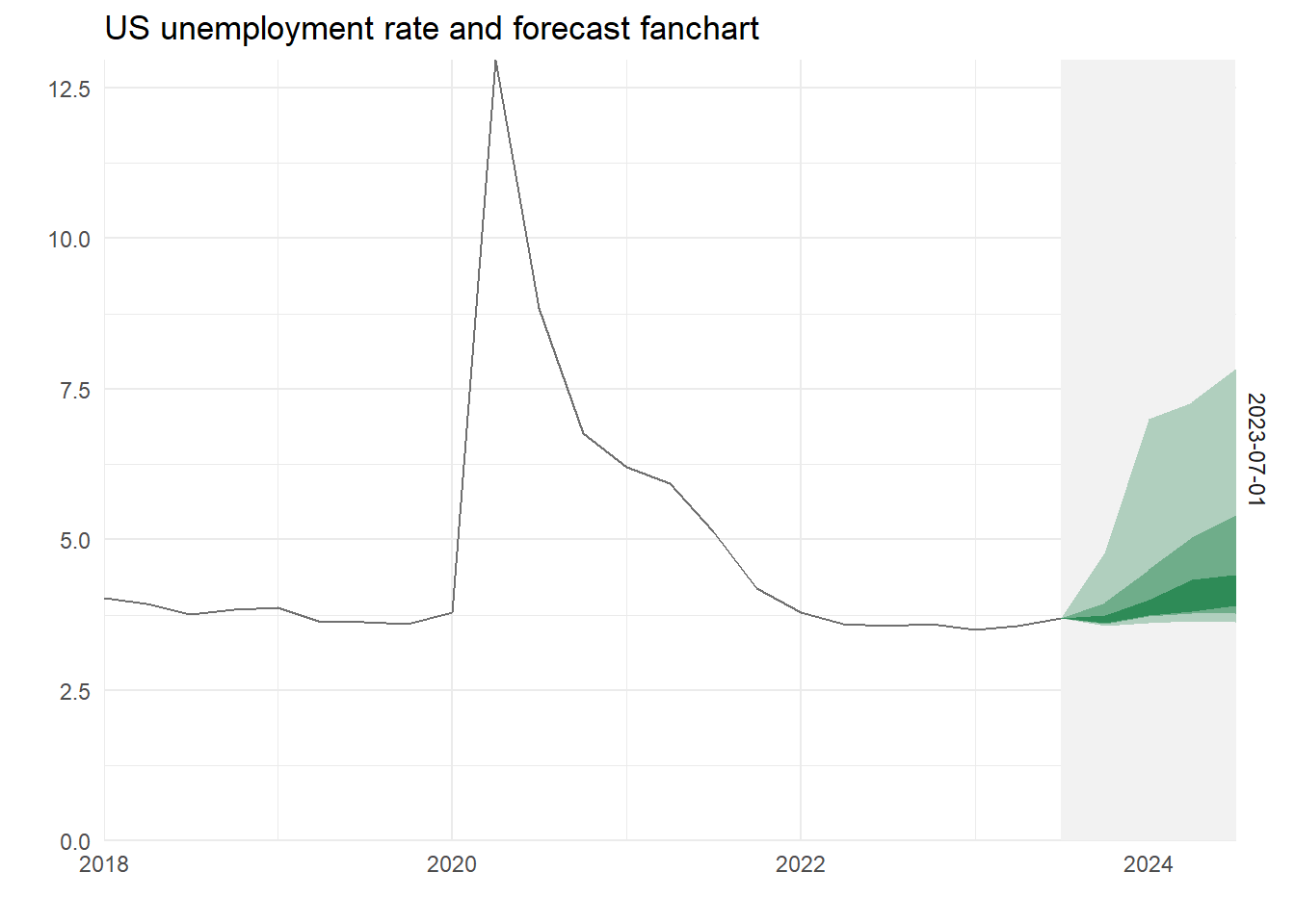
7.2 A fan chart

Gaglianone and Lima (2012) don’t actually produce a fan chart, they plot the implied densities. We can do that, but the fan chart is more useful, particularly for something as visually striking as unemployment forecasts.

The following code does a lot. It read the SPF individual forecasts and then averages them (you’ll see why later). Then it does the QR, calculates the points for the fans a plots a fan chart.

library(tidyverse)
library(readxl)
library(quantreg)
library(moments)

fls    <- "spfmicrodata.xlsx"
UNRATE <- read_csv("UNRATE (1).csv", col_types=cols(DATE=col_date(format="%d/%m/%Y"))) %>%
  select(Date=DATE, UNRATE) %>% 
  mutate(UNRATE=as.numeric(UNRATE)) %>%
  drop_na()

mx <- read_excel(fls, sheet="UNEMP", na="#N/A", col_types="numeric") %>%
  unite(Date, c(YEAR, QUARTER), sep=" ") %>% 
  mutate(Date = yq(Date)) %>% 
  select(Date, UNEMP0=UNEMP2, UNEMP1=UNEMP3, UNEMP2=UNEMP4, UNEMP3=UNEMP5, UNEMP4=UNEMP6, ID) %>%
  pivot_longer(cols=-c(Date, ID), names_to="Horizon") %>% 
  group_by(Date, Horizon) %>% 
  summarise(av   = mean(value, na.rm=TRUE)) %>% 
  mutate(Horizon = as.integer(str_sub(Horizon,6,6))) %>% 
  ungroup() %>%
  drop_na() 

# Pivot wider to put each series in a column to merge with UNEMP data
mxb <- mx %>% 
  pivot_longer(cols = -c(Date, Horizon), names_to = "Variable") %>% 
  unite("Names", Variable:Horizon, sep="") %>% 
  pivot_wider(names_from = Names) %>%
  slice(-n())

UNEMP <- UNRATE %>% 
  #group_by(paste(year(Date), quarter(Date))) %>% 
  #summarise(Date=min(Date), UNRATE=mean(UNRATE)) %>% 
  #select(Date, UNRATE) %>% 
  right_join(mxb, by="Date") 

# QReg 
sf <- seq(.05,.95,.15)[-4]

tail_colour   <- "grey95"
centre_colour <- "seagreen"

nq  <- length(sf)
nv  <- length(centre_colour)
col <- colorRampPalette(c(rbind(tail_colour, centre_colour), tail_colour))(nv*nq+1)[-1]

ystart <- 2017
ares   <- NULL
for (i in 0:4) {
          reg  <- c(paste0("av",i))
          eq   <- formula(paste0("lead(UNRATE,",(i+1),") ~ ", reg))
          eqrq <- rq(eq, data=UNEMP, tau=sf)
          res  <- broom::tidy(eqrq) %>% 
            group_by(tau) %>%
            mutate(dta = unlist(c(1, slice(select(UNEMP, reg), n())))) %>% 
            mutate(q   = sum(estimate*dta)) %>% 
            ungroup %>%
            mutate(Vintage = max(UNEMP$Date), Horizon = i) 
          ares <- bind_rows(ares, res)
}

aresx <- ares %>% 
  select(tau, q, Vintage, Horizon) %>% 
  distinct() %>%
  left_join(select(UNEMP, Date, UNRATE), by=c("Vintage" = "Date")) %>% 
  mutate(q = if_else(Horizon == 0, UNRATE, q)) %>% 
  pivot_wider(names_from = tau, names_prefix = "tau=", values_from = q) %>% 
  group_by(Vintage) %>% 
  mutate(fdate = seq.Date(from = Vintage[1], by = "quarter", length.out = 5)) %>% 
  ungroup() %>% 
  pivot_longer(starts_with("tau"), names_to = "q", values_to = "Vals") %>% 
  mutate(qs = paste0("Q", q)) %>%
  mutate(qs = as_factor(desc(qs))) %>% 
  select(-UNRATE)

bck <- UNEMP %>% 
  select(Date, UNRATE) %>%
  filter(year(Date) > ystart) %>%
  mutate(Vintage = list(unique(aresx$Vintage)))  %>% 
  unnest(cols = Vintage) %>% 
  group_by(Vintage) %>% 
  filter(Date <= Vintage) %>% 
  ungroup() %>% 
  arrange(Vintage, Date)

ggplot(aresx) +
  geom_rect(aes(xmin=fdate, xmax=max(fdate), ymin=-Inf, ymax=Inf, group=q), fill=tail_colour) +
  geom_area(aes(x=fdate, y=Vals, group=qs, fill=qs), position="identity") +
  scale_fill_manual(values=col) +
  theme_minimal() + 
  theme(legend.position = "none") +
  scale_x_date(expand = c(0,0)) +
  scale_y_continuous(expand = c(0,0)) +
  geom_line(data=bck, aes(x=Date, y=UNRATE), colour="grey44") + 
  facet_grid(Vintage ~ .) +
  labs(title=paste("US unemployment rate and forecast fanchart"), y="", x="") 

7.3 Different horizons

We compute recursive quantile regressions are calculated in pseudo-real time (we don’t take revisions to \(u_t\) into account, but it should be noted these are relatively minor). We use the available SPF forecasts from the last period used in the estimation to make the quantile predictions.

Add we add a regressor – a measure of uncertainty.

# Add some scale/skew measures
mx <- read_excel(fls, sheet="UNEMP", na="#N/A", col_types="numeric") %>%
  unite(Date, c(YEAR, QUARTER), sep=" ") %>%
  mutate(Date = yq(Date)) %>%
  select(Date, UNEMP0=UNEMP2, UNEMP1=UNEMP3, UNEMP2=UNEMP4, UNEMP3=UNEMP5, UNEMP4=UNEMP6, ID) %>%
  pivot_longer(cols=-c(Date, ID), names_to="Horizon") %>%
  group_by(Date, Horizon) %>%
  summarise(n    = n(),
            av   = mean(value, na.rm=TRUE),
            IQR  = IQR(value,  na.rm=TRUE)/1.349,
            Var  = var(value,  na.rm=TRUE),
            SE   = sqrt(Var),
            MAD  = mad(value,  na.rm=TRUE),
            Skew = skewness(value, na.rm=TRUE)) %>%
  mutate(Skew = replace_na(Skew, 0)) %>%
  mutate(Horizon = as.integer(str_sub(Horizon,6,6))) %>%
  ungroup() %>%
  drop_na()

# Pivot wider to put each series in a column to merge with UNEMP data
mxb <- mx %>%
  pivot_longer(cols = -c(Date, Horizon), names_to = "Variable") %>%
  unite("name", Variable:Horizon, sep="") %>%
  pivot_wider() %>%
  slice(-n())

UNEMP <- UNRATE %>%
  #group_by(paste(year(Date), quarter(Date))) %>%
  #summarise(Date=min(Date), UNRATE=mean(UNRATE)) %>%
  select(Date, UNRATE) %>%
  right_join(mxb, by="Date")

# QReg 
sf <- seq(.05,.95,.15)[-4]

tail_colour   <- "grey95"
centre_colour <- c("maroon4","seagreen")

nq  <- length(sf)
nv  <- length(centre_colour)
col <- colorRampPalette(c(rbind(tail_colour, centre_colour), tail_colour))(nv*nq+1)[-1]

N   <- nrow(UNEMP)

K   <- 12
nt  <- 6

ystart <- 2018
meas   <- c("None", "Var")
setype <- "rank" # "rank" # "boot" "nid"

ares <- NULL
for (samp in seq(N-K,N,nt)) {
    UNEMPs <- head(UNEMP, samp)
    for (nm in 1:length(meas)) {
        for (i in 0:4) {
          reg  <- c(paste0("av",i))
          if(nm > 1) reg <- c(reg, paste0(meas[nm],i))
          eq   <- formula(paste0("lead(UNRATE,",(i+1),") ~ ", paste(reg, collapse = " + ")))
          eqrq <- rq(eq, data=UNEMPs, tau=sf)
          res  <- broom::tidy(eqrq, se.type=setype) %>% 
            group_by(tau) %>%
            mutate(dta = unlist(c(1, slice(select(UNEMPs, all_of(reg)), n())))) %>% 
            mutate(q   = sum(estimate*dta)) %>% 
            ungroup %>%
            mutate(Vintage = max(UNEMPs$Date), Horizon = i, Dispersion = meas[nm]) 
          ares <- bind_rows(ares, res)
        }
    }
}

aresx <- ares %>% 
  select(tau, q, Vintage, Horizon, Dispersion) %>% 
  distinct() %>%
  left_join(select(UNEMP, Date, UNRATE), by=c("Vintage" = "Date")) %>% 
  mutate(q = if_else(Horizon == 0, UNRATE, q)) %>% 
  pivot_wider(names_from = tau, names_prefix = "tau=", values_from = q) %>% 
  group_by(Dispersion, Vintage) %>% 
  mutate(fdate = seq.Date(from = Vintage[1], by = "quarter", length.out = 5)) %>% 
  ungroup() %>% 
  pivot_longer(starts_with("tau"), names_to = "q", values_to = "Vals") %>% 
  mutate(qs = paste0(Dispersion, gsub("tau=", "", q))) %>%
  mutate(qs = factor(desc(qs))) %>% 
  mutate(Dispersion = as_factor(Dispersion)) %>% 
  select(-UNRATE)

bck <- UNEMP %>% 
  select(Date, UNRATE) %>%
  filter(year(Date) > ystart) %>%
  mutate(Vintage = list(unique(aresx$Vintage)))  %>% 
  unnest(cols = Vintage) %>% 
  group_by(Vintage) %>% 
  filter(Date <= Vintage) %>% 
  ungroup() %>% 
  arrange(Vintage, Date)

aresx %>%
  ggplot() +
  geom_rect(aes(xmin=fdate, xmax=Vintage %m+% months(3), ymin=-Inf, ymax=Inf, group=q), fill=tail_colour) +
  geom_area(aes(x=fdate, y=Vals, group=qs, fill=qs), position = "identity") +
  scale_fill_manual(values=col) +
  theme_minimal() + 
  theme(legend.position = "none") +
  scale_x_date(expand = c(0,0)) +
  scale_y_continuous(expand = c(0,0)) +
  geom_line(data=bck, aes(x=Date, y=UNRATE), colour="grey44") + 
  facet_grid(Vintage ~ Dispersion) +
  labs(title=paste("US unemployment rate and forecast fanchart"), y="", x="")